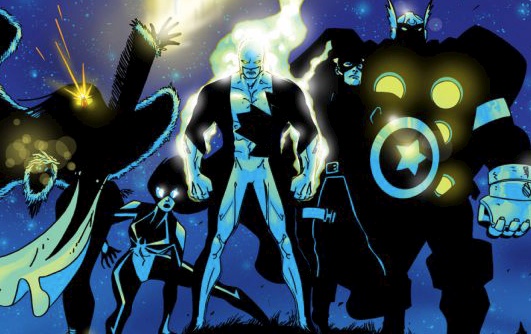
The Guardian/Vindicator battle-suit has undergone many stylistic changes, but only two stand out for me - the one in the Alpha Waves header at the top of the web-page, and this one:
Can you see the difference? This one is more symmetrical on the shoulders and legs. The maple leaf is still a "wrap-around" design.
Regarding the poll, I'm not including the vol 2 design (which was too cluttered) or the vol 3 design (because the maple leaf was too small).
Which do you prefer: the "original," or the more recent, symmetrical design?
Personally, I find the original "all-white left leg" version to be kinda ugly.


 Reply With Quote